A procurement lead and an ESG reporting lead are looking at the same portfolio and asking completely different questions of it. The Analytics section gives each of them a dashboard built around their question rather than one dashboard everyone has to interpret.
The five views
Analytics in the left rail opens onto five entries:
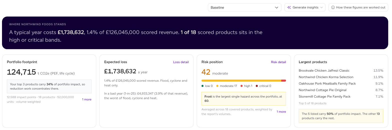
- Business: what a bad year costs and where the footprint sits. Its key row is Portfolio footprint, Expected loss, Risk position and Largest products; Land sector at risk is a tab. At company scope, Protection gap and Scenario resilience follow where your account has those lenses.
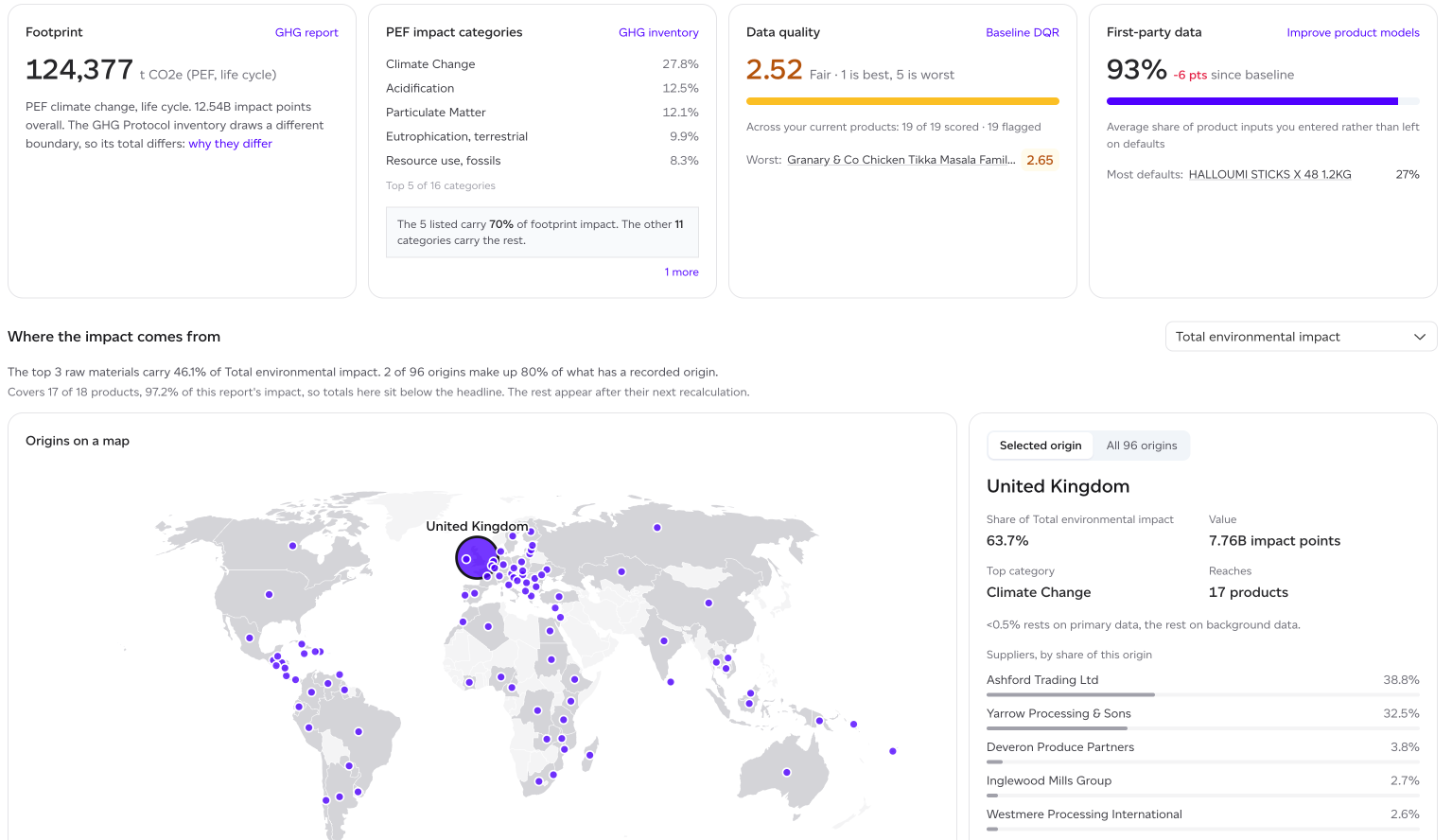
- ESG: the reporting picture. Its key row is Footprint, PEF impact categories, Data quality and First-party data; then Where the impact comes from on a map, with the top sources by raw material and origin, and the footprint By product category. The detail is in tabs: Impact categories, Ingredients, Per kg, Beyond ingredients, Land sector (FLAG), FLAG trend and FLAG commodities, with Disclosure readiness and the Climate disclosure pack where your plan includes them. At company scope, Baseline footprint and Baseline coverage show the workspaces' baselines and how much of the company they cover.
- Product: the development picture. Where impact sits within products, and what a formulation change would move.
- Procurement: the supply picture. Suppliers, sourcing countries and the exposure that comes with them. Its map, Where your supply comes from, shows each origin with the suppliers sourcing from it; Origin exposure is a tab.
- Risk, with Climate & Nature risk on your plan: the risk of the report you pick. It is a page of its own rather than a set of cards. See Climate & Nature Risk.
They read the same underlying figures. What differs is what is put first and what is left out. Each view opens with a dark band that says where you stand in a sentence (on ESG, the reportable footprint in CO2e, from the PEF climate change category), then a row of key figures, then the detail, with secondary cards one click away as tabs.
Each card also carries a one-line reading of its own number, so the figure arrives with its interpretation rather than needing one.
AI insights
AI insights is a button beside the report picker. It reads Generate insights until a set exists, then AI insights · 3 findings (or AI insights · generating while a set is written). It opens a panel of findings generated against your actual portfolio rather than a template, one finding open at a time. Each finding carries:
- a severity (high or medium) and a category such as concentration, trend or risk;
- a headline and a short explanation citing your own products and figures;
- Evidence, the figures the finding was drawn from, so you can check it rather than take it on trust;
- Do next, concrete actions, each labelled with the role that would own it and roughly what it would take.
The panel shows when the set was generated and a 'Data changed since' warning when your portfolio has moved since the insights were written. That warning matters: an insight is a snapshot, and stale figures in a confident sentence are worse than no sentence.
Regenerate produces a fresh set and counts against a monthly allowance, since each run is a real model call; How these figures are worked out says how much of it is left. Existing findings stay in place when the allowance is used up, so the dashboard still reads.
Insights summarise and suggest. They do not decide, and they know nothing about your cost, contracts or product roadmap. Read them as a fast orientation, then look at the numbers underneath.
Workspace and company scope
Analytics in the left rail covers the workspace you are in. Where your organisation runs several workspaces, choose Company analytics from the workspace menu at the top of the left rail to roll them into one figure, so "what is our footprint" has a single answer rather than one per workspace.
Company analytics is a separate part of the plan, and access can be restricted by role, because a company-wide rollup crosses boundaries that workspace permissions otherwise keep.
Dashboards open on your baseline, and can be pointed at any baseline, historical or forecast report. Company analytics has its own Risk entry, over one baseline period at a time.
'How these figures are worked out' explains the basis of what you are reading, which is worth opening once: the workspace and company figures are built differently, and so are the weighted and unweighted shares.